There are finite resources allocated each year for global health initiatives. In order to use these funds as effectively as possible, we need to be able to measure which diseases, injuries, and risk factors create the greatest burden on human health. Maybe unsurprisingly, no part of this task is simple. Even before we take on the enormous effort of measuring the burden of each cause, we need to decide what units we’ll be measuring this burden in.
Counting deaths
In a previous post I explored US mortality data in an attempt to understand how people are dying in my home country. When we calculate global health burden using death counts, the top 20 causes of death can be seen in the dot plot below.1 I am using the percent of total deaths as the X axis so that I can compare it directly to other metrics later.
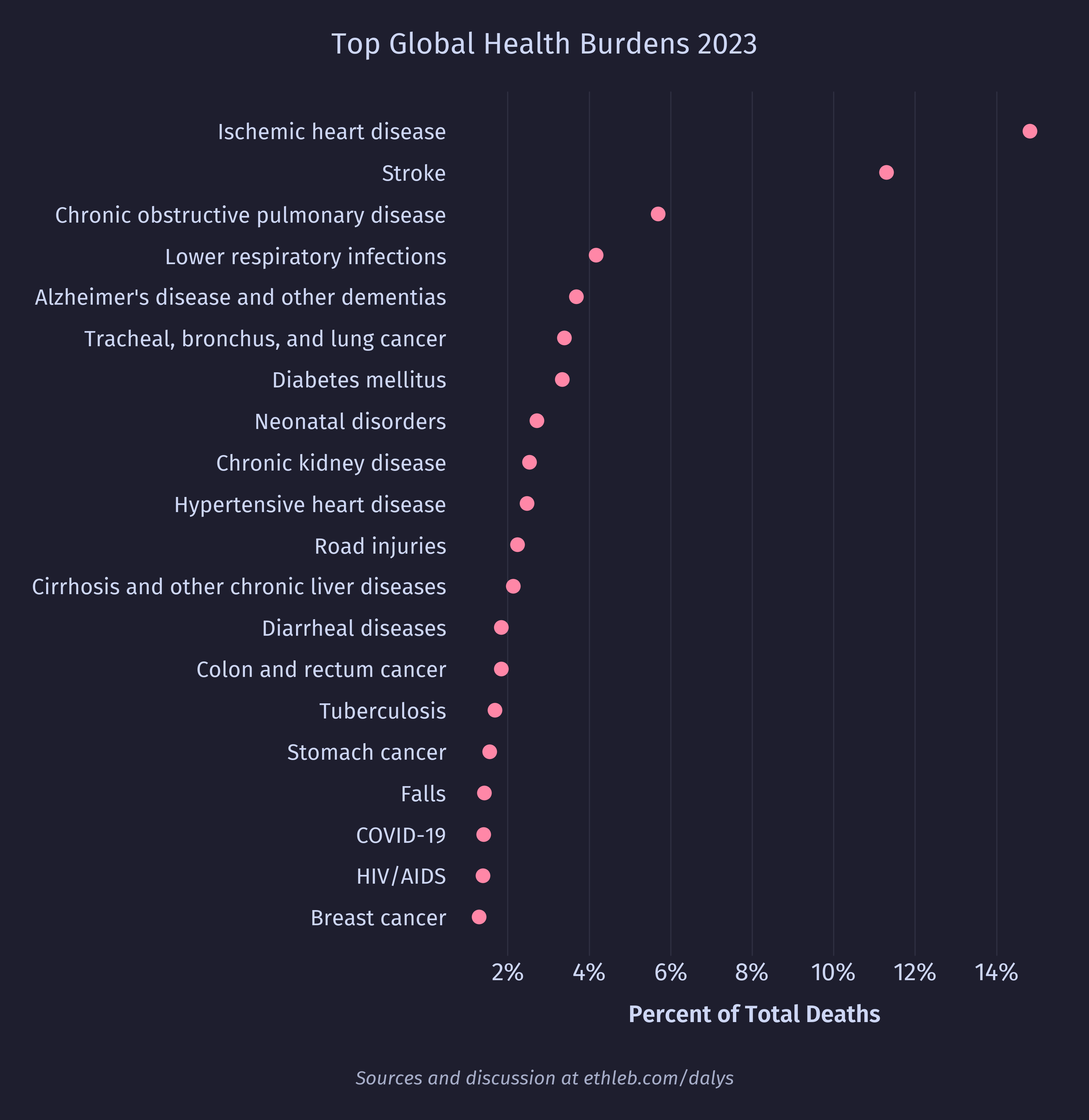
Raw death counts are simple and easy to interpret, but are limited in how much information they carry. If I gave you the option to extend a person’s life by a year, or to extend the person’s life for two years, the second seems like the clearly better option. Recognizing this, it seems that we value not just the number of lives, but the volume of life. As an extension, it seems reasonable to support a health initiative that prevents the deaths of a million 10-year-old lives (each of whom may live another 79 years) over a health initiative that prevents the deaths of a million 60-year-old lives (each of whom may live another 30 years). This brings us to our second unit of health burden.
The Year of Life Lost (YLL)
Instead of simply counting deaths from some cause, we could count how many years of life that cause costs. To do this, we first need to know what a person’s life expectancy is at each age. For the GBD study, they created what they call a Theoretical Minimum Risk Life Table (TMRLT), which is an idealized table containing the best case scenario life expectancy at each age. This table is generated using the lowest mortality rate for each age in any location with a population of more than 5 million. Here is the life table used in the study, rounded to two decimal places: 2
| Age | Life Expectancy | Age | Life Expectancy | Age | Life Expectancy |
|---|---|---|---|---|---|
| 0 | 88.87 | 30 | 59.20 | 65 | 25.68 |
| 1 | 88.00 | 35 | 54.25 | 70 | 21.29 |
| 5 | 84.03 | 40 | 49.32 | 75 | 17.10 |
| 10 | 79.05 | 45 | 44.43 | 80 | 13.24 |
| 15 | 74.07 | 50 | 39.63 | 85 | 9.99 |
| 20 | 69.11 | 55 | 34.91 | 90 | 7.62 |
| 25 | 64.15 | 60 | 30.25 | 95 | 5.92 |
To calculate YLL at a given age of death we can simply use the life expectancy for that age from our table. So, the death of a 25-year-old is equivalent to 64 years of life lost (64 YLL). Applying this to the two hypothetical health interventions from the previous section, we find that preventing the deaths of a million 10-year-olds would prevent 79 million YLL, while preventing the deaths of a million 60-year-olds would prevent only 30.3 million YLL. We can even calculate that to save the same number of YLLs as we would by preventing 1 million 10-year-old deaths, we would need to prevent about 2.6 million 60-year-old deaths. Let’s add YLLs to our dot plot and sort the causes by YLLs instead of deaths:1
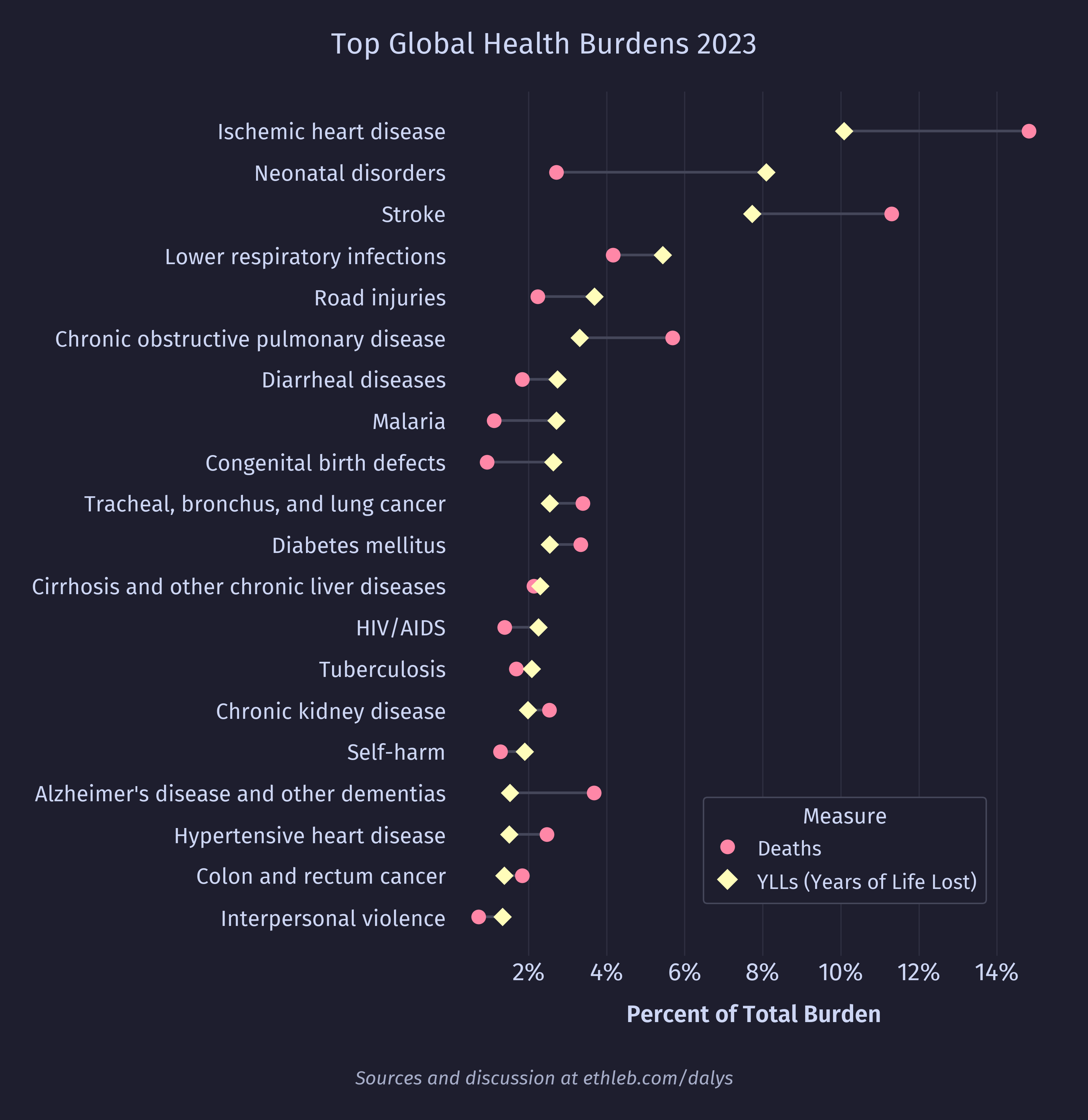
Notice that causes affecting primarily younger people move up in the ranking (most dramatically “Neonatal disorders”), and causes affecting primarily older people move down.
The YLL is higher resolution than a raw death count, but it still doesn’t capture some dimensions of health burden. What if some disease doesn’t kill anyone, but causes some health loss like blindness or another disability? Should we fund a health initiative projected to prevent 1,000 deaths, or one projected to prevent 10,000 cases of blindness? Can we compare mortality directly to morbidity?
The Disability Adjusted Life Year (DALY)
In the early 1990s the World Bank asked the epidemiologists Christopher Murray and Alan Lopez to study the burden of disease. To do so, the epidemiologists created the Disability Adjusted Life Year (DALY)3. Since then, the DALY has become the standard unit for measuring health burden and has been backed by the World Health Organization4. The Global Burden of Disease (GBD) study, a collaborative effort of over 20,000 individuals5 around the world led by the Institute for Health Metrics and Evaluation (IHME), estimates the DALY burden of 463 health outcomes and risk factors, across 204 countries and territories.5 “At present, there is no other comparable metric with this kind of coverage.”6 Burden in DALYs is defined as the sum of YLLs and Years Lost Due to Disability (YLDs).
DALY = YLL + YLDIn this context, disability means any short or long term health loss. YLDs are the number of years lived with a disability, multiplied by some disability weight specific to that disability.7 Implicitly we are saying that a year lived with some disability is equivalent to some fraction of a YLL. How much of a YLL is different for each disability and is defined by the disability weight. Let’s see how our dot plot looks sorted by DALYs:1
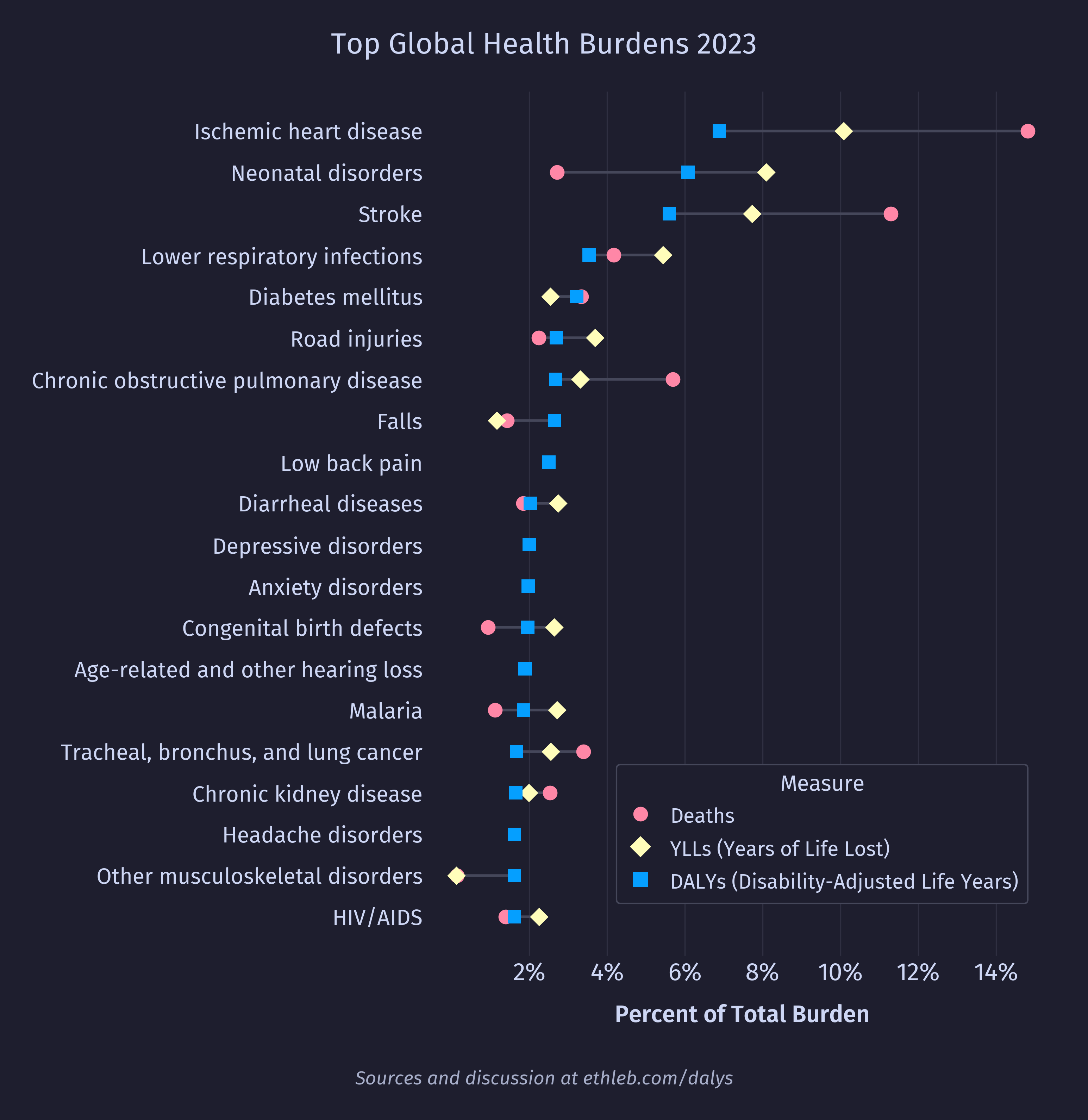
Suddenly we see health burdens that don’t cause death joining the rankings, most notably low back pain. We also see that depressive and anxiety disorders have appeared and that there are no deaths attributed to them. As far as I can tell this is because a suicide associated with a mental health disorder is categorized under “Self harm” (which doesn’t make the top 20 ranking) rather than under the mental health disorder. It is telling that these mental health disorders are in the top 20 causes of health burden even with their associated deaths counted separately.
Disability Weights
What exactly are these mysterious disability weights? Disability weights “represent the magnitude of health loss associated with specific health outcomes”.8
The disability weight for a health state is a number on a scale from zero to one that represents the severity of health loss associated with the state. A value of 0 implies that a health state is equivalent to full health, and a value of 1 implies that a state is equivalent to death. 9
So, a disability weight of 0.25 means that a year lived in that health state has the value of 0.75 years lived in full health, and preventing one YLL is equivalent to preventing 4 years lived with that disability.
Where do these weights come from?
To generate disability weights, the GBD ran an enormous survey of over 60,000 people. This included 30,230 responses from “household surveys of adults aged 18 years or older (face-to-face interviews in Bangladesh, Indonesia, Peru, and Tanzania; telephone interviews in the USA) between Oct 28, 2009, and June 23, 2010; and an open-access web-based survey between July 26, 2010, and May 16, 2011”.9 In 2013, 30,660 responses were added from “web-based surveys of participants aged 18–65 years, completed in four European countries (Hungary, Italy, the Netherlands, and Sweden)”.10 In the 2012 study called “Common values in assessing health outcomes from disease and injury: disability weights measurement study for the Global Burden of Disease Study 2010”, Salomon and colleagues spell out the methodology:
The primary mode of eliciting responses was a paired comparison question, in which respondents were presented with descriptions of two hypothetical people, each with a particular health state, and then asked which person they regarded as healthier. 9
Responses were elicited from the general public “on the basis of the argument that, in a democratic society, the views of the general public are relevant in comparative assessments that inform public policy.”9
In essence, this was a huge game of would you rather. Based on the health state descriptions from this file, and the survey instructions from this file, I’ve reconstructed the survey for you to try. I have set this survey up to show you which health state the GBD concluded is the healthier one after you’ve answered, with 95% confidence intervals around it, so you can compare your answers with the survey results. In the real survey, respondents would not have gotten this feedback. The real survey was also limited to 15 questions per respondent, while this one is unbounded. Give it a go:
Instructions:
Now, we want to learn how people compare different health problems.
A person’s health may limit how well parts of his body or his mind works. As a result, some people are not able to do all of the things in life that others may do, and some people are more severely limited than others.
I am going to ask you a series of questions about different health problems. In each question I will describe two different people to you. You should imagine that these two people have the same number of years left to live, and that they will experience the health problems that I describe for the rest of their lives. I will ask you to tell me which person you think is healthier overall, in terms of having fewer physical or mental limitations on what they can do in life.
Some of the questions may be easy to answer, while others may be harder. There are no right or wrong answers to these questions. Instead, we are interested in finding out your personal views.
Who do you think is healthier overall, the first person or the second person?
All this raw survey data was fed to a probit regression model which spit out disability weights and 95% confidence intervals. These disability weights, however, were not yet bound between 0 and 1. In order to scale the disability weights so that 0 is at full health and 1 is equivalent to death, the researchers needed a way to relate morbidity to mortality. For this they used a second type of question in only the web survey. These were called “population health equivalence” questions9, and they compared programs that prevented death to programs that prevented disability. Try it out:
Instructions:
Thank you for those answers. The last questions will ask you to compare the overall health benefits produced by two different programs. Imagine there were two different health programs.
Which program would you say produced the greater overall population health benefit?
The GBD used this process to generate disability weights for 235 unique health states. You can see the distribution of the weights below.
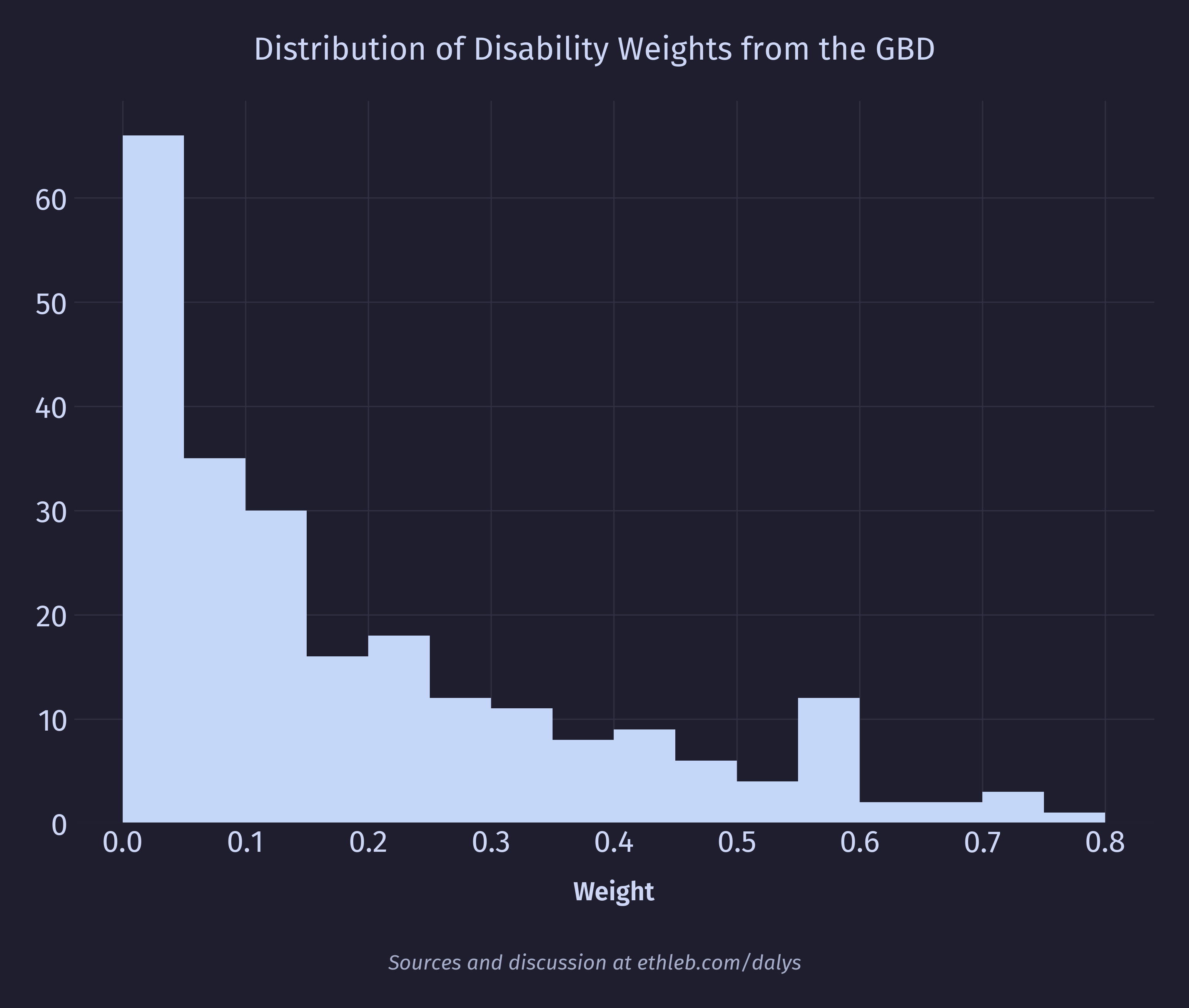
Of these health states, 66 have a weight of less than 0.05, “implying that 1 year of life lost because of premature mortality is equivalent to more than 20 years lived in the specific health state.”9 Here are the 3 health states with the smallest weights: 8
| Health state | Description | Disability weight (95% Confidence Interval) |
|---|---|---|
| Distance vision, mild impairment | has some difficulty with distance vision, for example reading signs, but no other problems with eyesight. | 0.00304 (0.00101 - 0.00696) |
| Anemia, mild | feels slightly tired and weak at times, but this does not interfere with normal daily activities. | 0.00370 (0.00131 - 0.00814) |
| Amputation of finger(s), excluding thumb (long term, with or without treatment) | has lost a finger of one hand. At times there is pain and tingling in the stump. | 0.005 (0.002 - 0.01) |
And here are the 3 health states with the largest weights: 8
| Health state | Description | Disability weight (95% Confidence Interval) |
|---|---|---|
| Schizophrenia, acute state | hears and sees things that are not real and is afraid, confused, and sometimes violent. The person has great difficulty with communication and daily activities, and sometimes wants to harm or kill himself (or herself). | 0.778 (0.606 - 0.900) |
| Intensive care unit admission | is very ill and often asleep or unconscious; when awake cannot move in bed, cannot speak, is completely dependent on others and is anxious | 0.743 (0.556 - 0.878) |
| Spinal cord lesion at neck level (untreated) | is paralyzed from the neck down, with no feeling or control over any part of the body below the neck, and no urine or bowel control. Arms and legs are in fixed, bent positions, and the person gets frequent infections and pressure sores. | 0.732 (0.544 - 0.871) |
Criticisms of disability weights
Consistency across cultures
For the disability weights to represent some objective measure of health, they need to be consistent across different cultures. To test whether their results satisfied this condition, Salomon and colleagues measured the correlation between each country the survey was run in, and the pool of all survey results. What they found was a “high degree of consistency” between the results in different countries, including the populations with the highest and lowest education.9 However, in their paper “Disability weights in the global burden of disease 2010 study: two steps forward, one step back?” Voigt and King point out limitations of the sample:
the GBD 2010 study is based on an idiosyncratic sample that is – as Salomon et al. acknowledge – not globally representative. For the household and web surveys combined, 35% of the respondents were from the United States, 64% were highly educated and only 17% had a primary education or less. Only four countries – Bangladesh, Indonesia, Peru and the United Republic of Tanzania – represent the multiplicity of cultures existing outside the United States and the entire sample is heavily skewed towards the highly educated. 11
Salomon and colleagues also note:
while our results point to a high degree of consistency in responses on direct comparisons between health states, the study did not include population health equivalence questions in the household surveys. Therefore, we are not able to draw conclusions about whether respondents make similar trade-offs between fatal and non-fatal outcomes across countries. 9
Nonetheless, Salomon and colleagues conclude with “we did not observe evidence to support the hypothesis that comparative assessments of health at a global level are undermined by extensive cultural variation.”9
Though it makes sense to me that culture would influence the perception of health, humans are generally similar to one another, and so it also makes sense to me that we would find similar health states that involve pain or reduced mobility similarly undesirable.
Devaluing disabled people
In “The value of DALY life: problems with ethics and validity of disability adjusted life years” Arnesen and Nord write:
the DALY approach implicitly attaches lower value to life extending programmes for disabled people than to corresponding programmes for people without disability. 4
This is, I think, the most uncomfortable implication of the DALY. If we take the measure at face value, then the life of a blind person is worth less than the life of a sighted person. Given the option to prevent the death of one or the other, we should prevent the death of the sighted person because the remaining life years of the disabled person are discounted while those of the fully healthy person are not. This does not align with my moral intuition. Arnesen and Nord point out the consequences of valuing healthy lives more:
the healthier the person, the more valuable their life is to themself and to society and the greater their claim on restricted healthcare resources to have their life extended. This makes sense only if the value of life is not seen as a dimension distinct from health, but rather as a direct positive function of health.4
The DALY would seem to say that a blind person’s life is 19% (blindness having a disability weight of 0.1873) less valuable than the life of a sighted person, or possibly even that a blind person is 19% less alive. Neither of these interpretations makes sense to me.
Of course, the alternative of not weighting disabled years as less valuable than years at full health solves this problem, but creates a new one. If a disability had a weight of 0, then preventing or curing that disability would have no value. This is clearly not the case, and would result in fewer resources going toward prevention and treatment of the disability.
Health vs welfare
In designing the study to create disability weights, the researchers chose to isolate health from welfare. Welfare refers to how health interacts with a person’s environment. For example, the same health state of losing a foot means very different things in a country where prosthetics are readily available and in a country where they are not. One criticism is that the survey didn’t always do a good job of this stated aim:
despite claims that the methods followed in the GBD 2010 study isolated “health” from welfare, well-being and social context, a close reading of those methods illustrates how difficult it is to maintain a strict separation between “health” simpliciter and the effects of particular conditions on individuals in particular contexts. For example, the descriptions of disfigurement include the reactions of others to the disfigurement (“makes others feel uncomfortable”) and the implications of these reactions for the individual with the disfigurement (“causes the individual to avoid social contact”). 11
Another criticism questions how useful it is to measure health rather than welfare:
Let us consider two countries with equal numbers of people with impaired vision. In one country corrective lenses are readily available and people with visual impairment have good job prospects; in the other, there are no corrective lenses and employment opportunities are few. In an abstract sense the amount of impaired vision is the same in both populations, but the impact of the impairment is radically different – a consideration that is vital to the distribution of resources. 11
The focusing illusion
Disability weights for DALYs are generated by asking people who do not have the disabilities to compare the health of two people with disabilities. In practice we find that people are not always good at imagining what life with a given disability is like. Specifically implicated in this is the focusing illusion. In “Measuring health: How we use (and sometimes don’t use) DALY estimates”, the organization Founders Pledge writes about the implications of this cognitive bias:
In particular, it has been argued that the ‘focusing illusion’ skews our predictions of disease severity. The focusing illusion is the tendency to focus narrowly on attention grabbing aspects of a particular disease […] people may overstate the impact of diseases with dramatic symptoms, and underestimate the impact of diseases which are less ‘attention-grabbing’—such as the impact of chronic pain or loneliness.6
They also point out that people tend to adapt to some disabilities better than others. In particular, mental health disorders are especially hard to adapt to, resulting in a decrease of life satisfaction larger than what would be predicted by their disability weights:
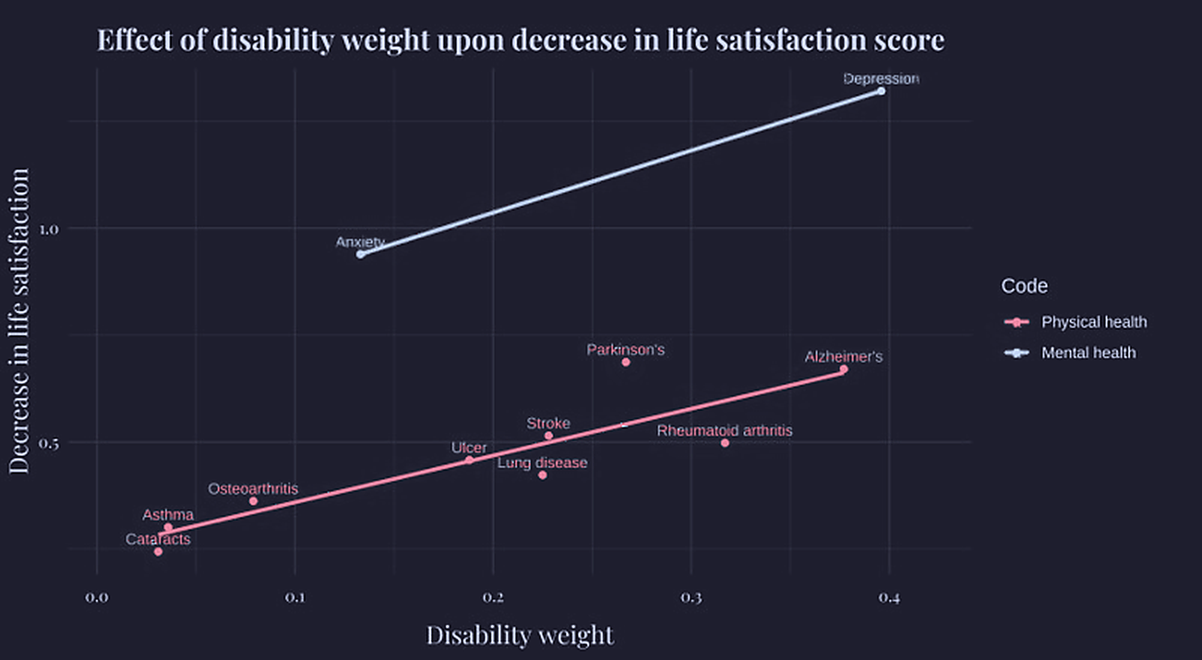 This chart was taken from this founders pledge page. Colors were edited to match this page’s theme.
They go on to write:
This suggests that the impact of illnesses which are less subject to hedonic adaptation are underestimated, relative to illnesses which people are better able to adjust to.
we should not expect that people’s predictions about ‘which person is healthier’ will necessarily map onto people’s lived experience of a given disease. For this reason, we aim to incorporate different data sources (for example, data which directly links living with a given disease to its impact upon wellbeing) where possible. 6
The Wellbeing Year (WELLBY)
What if some intervention is forecasted to improve lives through channels other than the prevention of death or disability? If we only use DALYs to calculate its value, then we would conclude that it’s worthless, which is clearly wrong. For this reason (among others) the Happier Lives Institute advocates for the use of the WELLBY, a direct measure of wellbeing. One WELLBY is defined as an increase of one point of wellbeing on a scale from 0-10, for one year. The Happier Lives Institute recommends using life satisfaction as the measure of wellbeing, which can be measured with a single survey question asking how satisfied a person is with their life “on a scale from 0 ‘not at all’ to 10 ‘completely’”.12 They think this method of measuring wellbeing offers a good compromise between accuracy, cost, and invasiveness. So, someone going from a life satisfaction of 6/10 to 7/10 for one year would be worth one WELLBY. Someone going from a life satisfaction of 6/10 to 8/10 for two years would be worth four WELLBYs (2 WELLBYs per year for 2 years).
Using the WELLBY to compare the value of extending life to improving life
To convert a death into units of lost WELLBYs we can use this formula: 13
WELLBY = YLL * (Expected Life Satisfaction - Neutral Point)Here, we multiply the years of life that were lost (YLL) by the life satisfaction we would expect that person to have over the remainder of their life minus some neutral point. The neutral point is the life satisfaction at which life is neither good nor bad. What neutral point to use is both controversial and has a significant impact on the results of analyses that use WELLBYs.
Choosing a neutral point
One option is to set the neutral point to 0. This would mean that a life satisfaction of 0/10 is neutral, and that any higher life satisfaction is positive. This would also mean that being alive can never be worse than being dead, no matter what state of life a person is in. In their report “The elephant in the bednet: the importance of philosophy when choosing between extending and improving lives”, the Happier Lives Institute points out that
we typically think it is possible to be in a state worse than death - a life of unrelenting misery and torture, for instance. Part of the argument for legalising physician-assisted suicide is that death can, sometimes, be better for somebody […] Indeed, we often do have the intuition, at least for those who are suffering and at the end of life, that the priority is palliative care - making them comfortable rather than prolonging their lives at any cost.13
The alternative is setting the neutral point above 0, such as at 2/10 or 5/10. Setting the neutral point to 2/10 would mean that a life satisfaction of less than 2/10 would be a state worse than death. The authors point out an uncomfortable implication of using a neutral point greater than 0:
if people are in states worse than death, then it is bad to extend their lives, even if those people want to keep living and we could extend their lives for free. 13
Different choices for the neutral point have significant implications for the results of analyses, and by extension for resource allocation. As an example, the Happier Lives Institute estimates StrongMinds (a group therapy organization) as being 14% less cost effective than the Against Malaria Foundation (which distributes insecticide treated bednets to affected areas) assuming a neutral point of 0. Assuming a neutral point of 5, StrongMinds becomes nearly 12 times more cost effective.13
The question of where to set the neutral point is really a question of how survey respondents are interpreting the life satisfaction scale. When people are asked about their life satisfaction on a scale of 0-10, what number do they think of as neutral? This is an empirical question that can be answered with further research.
Other accounts of the badness of death
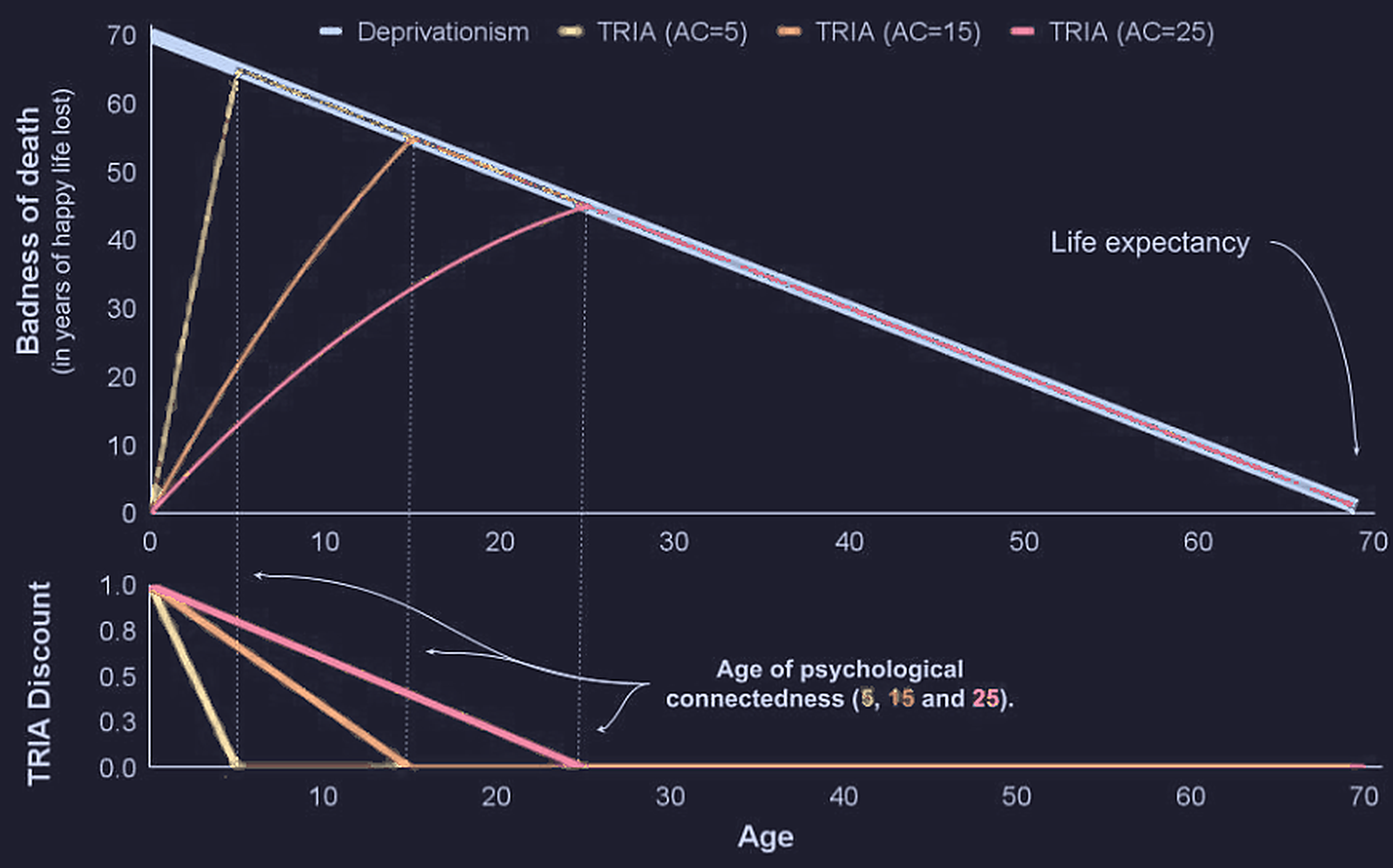
The definition of WELLBYs above is based on an assumption that death is bad because it deprives the deceased of future happiness. This assumption is called deprivationism. In their report, the Happier Lives Institute includes two other possibilities for how death might be bad.
The first is called the time-relative interest account, and is based on the idea that future years are more valuable when a person is more psychologically connected to their future self. This account of the badness of death discounts the death of children who are less connected to who they would be when they grow older. Here is a chart from the report (with colors edited to match this page’s theme) showing the effects of this discounting assuming different ages for full connectedness:
The second other account of the badness of death is epicureanism: death isn’t actually bad! There are a few arguments for why this might be true. One is that a person can never experience death, because the moment they die they are no longer experiencing anything. How can something be good or bad for a person if they never experience it? Another interesting argument for this stance comes from symmetry. If not existing before we were born wasn’t bad for us, then why would not existing after death be bad for us? Under the assumption of epicureanism, a death is only bad in that it causes pain for loved ones, and in that the process of dying itself involves suffering. While epicureanism is a somewhat unintuitive and possibly radical stance, I find myself fond of it.
I’ve given only a very brief description of these stances. The Happier Lives Institute examines how each of these assumptions impacts the results of cost effectiveness analysis, and if you’re curious I would encourage you to read their report.13
Conclusion
Choosing between public health initiatives (some of which will improve lives and some of which will extend them) is something we don’t have the luxury of not doing. There are tragically limited resources dedicated to global health each year. Some things will be funded and some won’t. To maximize the good those resources do, we need some measure that we can use to compare options. Different measures of health burden carry with them different sources of error and philosophical assumptions. None of the metrics I’ve talked about are perfect, and it seems plausible that there will never be a perfect one.
The important thing, I think, is to not treat measures like these as a black box. It’s easy to treat 100 DALYs or 500 WELLBYs or any other product of science as something objective and inarguable, but when decision makers use these numbers to set priorities they should do so with an understanding of how the underlying data may be biased, and what philosophical views the metrics carry with them.
Footnotes
-
Global Burden of Disease Collaborative Network. Global Burden of Disease Study 2023 (GBD 2023) Results. Seattle, United States: Institute for Health Metrics and Evaluation (IHME), 2024. Available from https://vizhub.healthdata.org/gbd-results/. ↩ ↩2 ↩3
-
Global Burden of Disease Collaborative Network. Global Burden of Disease Study 2019 (GBD 2019) Reference Life Table. Seattle, United States of America: Institute for Health Metrics and Evaluation (IHME), 2020. ↩
-
Measuring Global Health with the DALY https://www.howwegettonext.com/measuring-global-health-with-the-daly/ ↩
-
Arnesen, T, and E Nord. “The value of DALY life: problems with ethics and validity of disability adjusted life years.” BMJ (Clinical research ed.) vol. 319,7222 (1999): 1423-5. doi:10.1136/bmj.319.7222.1423 ↩ ↩2 ↩3
-
Global Burden of Disease (GBD) About https://www.healthdata.org/research-analysis/about-gbd ↩ ↩2
-
Measuring health: How we use (and sometimes don’t use) DALY estimates https://www.founderspledge.com/research/measuring-health ↩ ↩2 ↩3
-
Measures of the burden of morbidity and mortality on the population https://www.healthknowledge.org.uk/node/801 ↩
-
Global Burden of Disease Collaborative Network. Global Burden of Disease Study 2023 (GBD 2023) Disability Weights. Seattle, United States of America: Institute for Health Metrics and Evaluation (IHME), 2025. ↩ ↩2 ↩3
-
Salomon JA, Vos T, Hogan DR, Gagnon M, et al. Common values in assessing health outcomes from disease and injury: disability weights measurement study for the Global Burden of Disease Study 2010. The Lancet. 2012 Dec 13; 380: 2129–2143. ↩ ↩2 ↩3 ↩4 ↩5 ↩6 ↩7 ↩8 ↩9
-
Salomon JA, Haagsma JA, Davis A, Maertens de Noordhout C, Polinder S, Havelaar AH, Cassini A, Devleesschauwer B, Kretzschmar M, Speybroeck N, Murray CJL, Vos T. Disability weights for the Global Burden of Disease 2013 study. The Lancet. 2015 Oct 19. doi:10.1016/S2214-109X(15)00069-8. ↩
-
Voigt, Kristin, and Nicholas B King. “Disability weights in the global burden of disease 2010 study: two steps forward, one step back?.” Bulletin of the World Health Organization vol. 92,3 (2014): 226-8. doi:10.2471/BLT.13.126227 ↩ ↩2 ↩3
-
The measurement of wellbeing https://www.happierlivesinstitute.org/report/the-measurement-of-wellbeing ↩
-
The elephant in the bednet: the importance of philosophy when choosing between extending and improving lives https://www.happierlivesinstitute.org/report/the-elephant-in-the-bednet/ ↩ ↩2 ↩3 ↩4 ↩5